Union Management Platform UI/UX
Client
Connect+ (NEP Services)
Industry
Non-Profit / SaaS
The Challenge
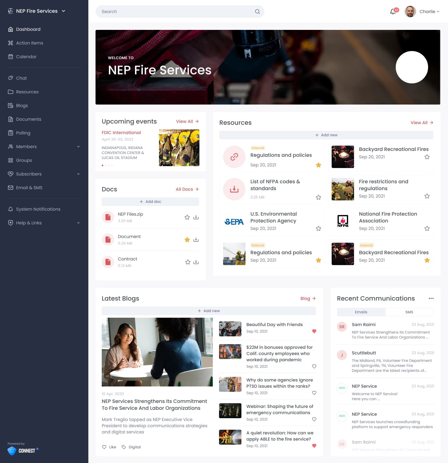
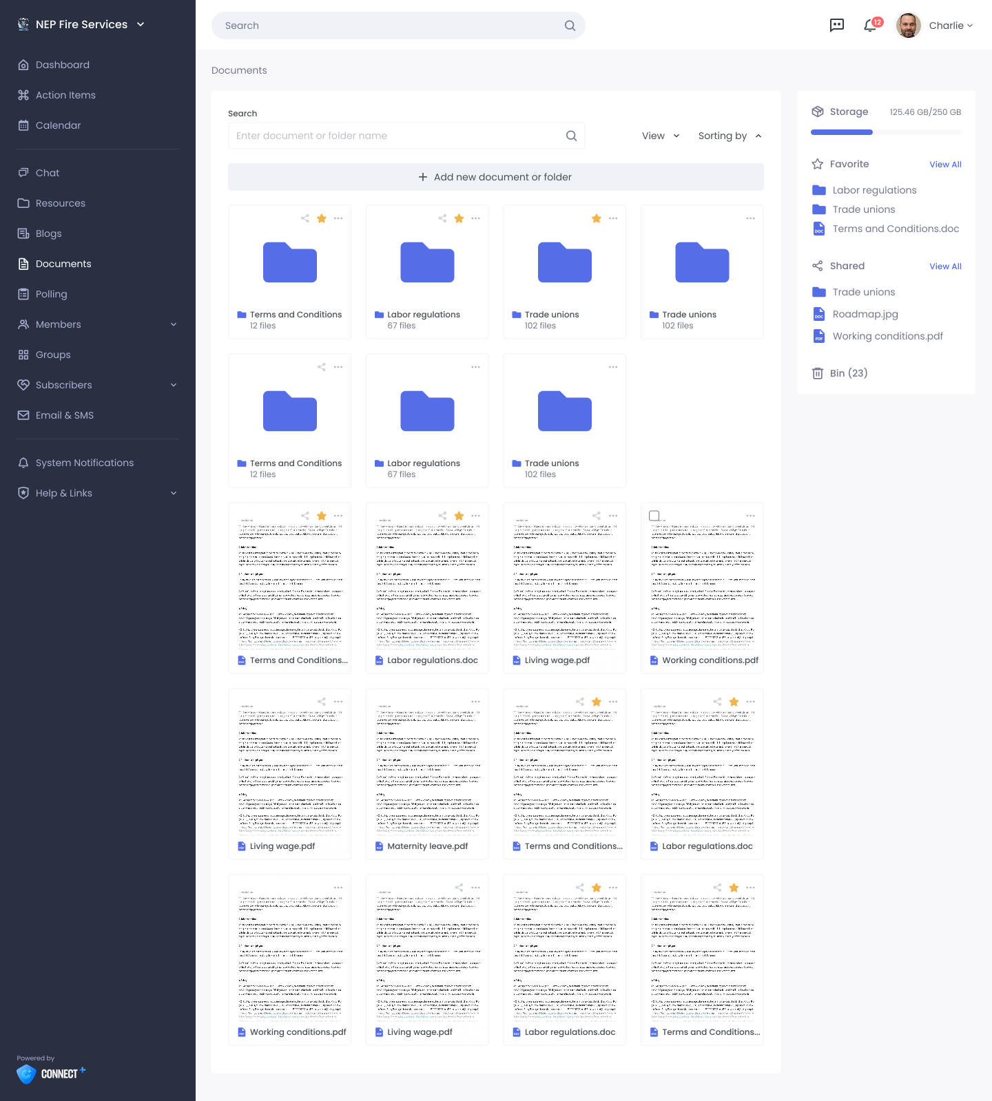
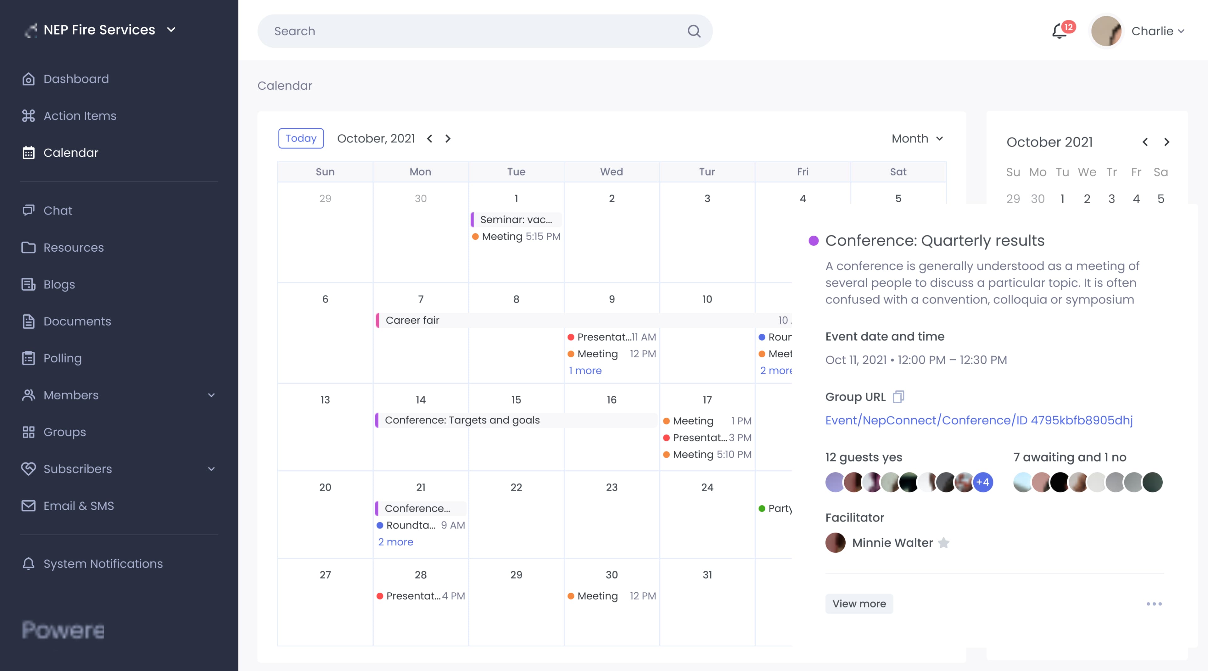
Connect+ is a critical platform for unions managing members, dues collection, internal communications, voting, and news distribution. But the legacy interface—a confusing mix of nested menus, unclear workflows, and poor visual hierarchy—frustrated both union staff and members. User adoption was stalling, support tickets were climbing, and the outdated design made it hard for NEP Services to ship new features. Union staff needed clearer workflows for member management, members needed a more intuitive experience on mobile, and the entire platform required a modern visual foundation.
Our Solution
We started with comprehensive user research, interviewing union administrators, staff, and members to understand their actual workflows and pain points. We then conducted a thorough UX audit, mapping the current information architecture and identifying bottlenecks. The redesign focused on simplicity: we reorganized the navigation, created a cleaner visual hierarchy, and optimized the most-used workflows for fewer clicks. We built 50+ high-fidelity Figma prototypes covering admin dashboards, member-facing interfaces, voting flows, and mobile experiences, complete with a comprehensive design system and reusable component library. The interactive prototypes were validated with key stakeholders before handoff. Beyond aesthetics, the new design unlocked faster development—the clear design system meant developers could build new features in half the time.
Project Gallery
Project Scope
- User research interviews & stakeholder workshops
- Complete UX audit & competitive analysis
- Information architecture redesign
- User journey mapping for key workflows
- High-fidelity Figma prototypes (50+ screens)
- Responsive design for desktop and mobile
- Design system & component library
- Interactive prototypes for stakeholder validation
- Comprehensive developer handoff documentation
- Accessibility review (WCAG 2.1)
Timeline
3 months
Results
Measurable impact and real business outcomes
Member Engagement Increase
Faster Feature Development
Reduction in Support Tickets
Technology Stack
"Rotate didn't just make our platform prettier—they fundamentally improved how our users interact with it. The design system they created is enabling us to ship features twice as fast, and our members are actually using the platform now."
Shubhangi
Director of Software Engineering
Frequently Asked Questions
How do you validate a redesign with internal stakeholders?
We create interactive Figma prototypes and conduct validation sessions with key stakeholders—admins, staff, and member representatives. These sessions uncover usability issues early and build buy-in before development begins. Prototypes let stakeholders experience the new flows, not just see static designs.
What's the impact of a design system on development speed?
A well-built design system can cut feature development time by 40-50%. Instead of building from scratch, developers assemble proven components. Consistency is automatic, accessibility is baked in, and developers spend time on unique logic rather than styling common patterns.
How do you handle mobile optimization in a complex platform redesign?
Mobile-first design thinking from the start. We design the mobile experience first, ensuring critical workflows work on small screens with touch interaction. Then we expand for tablet and desktop, adding complexity only where it adds value. This ensures the mobile experience is intentional, not an afterthought.